CASE STUDY ·
Brand identity
Eckhaus Capital
An established fund that had never had a brand.
YEAR
2025
DURATION
4 weeks
SCOPE
Brand identity
INDUSTRY
Wealth management

01
WHERE IT STOOD
An established boutique fund in equity and wealth management.
02
WHAT WAS OFF
Despite their reputation, they had no brand assets at all. No logo, and a website built from a generic template.
03
WHAT I SAW
The name itself held the answer: Eckhaus, German for a corner building at two intersecting streets.
04
WHAT I BUILT
One mark, a heritage palette, and classical type. Calm, confident, institutional.


WHAT WAS DELIVERED
Logo system: vertical, horizontal, icon and text-only versions
Colour palette and type
Business cards
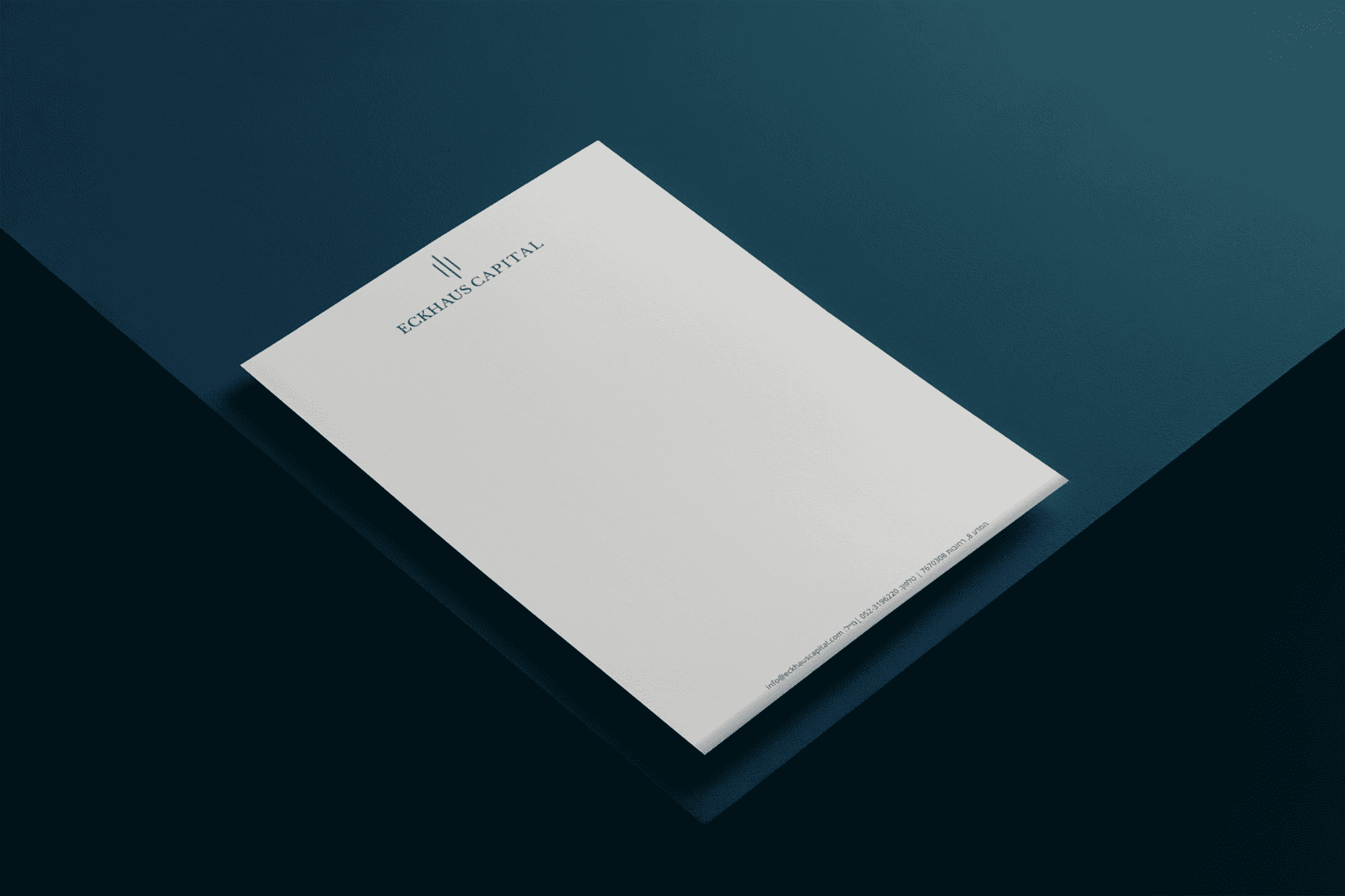
Letterhead
Presentation folder
Website hero design
NEXT PROJECT
Brand identity, social, AI images