Ao Ramen

Ao Ramen

Ramen-Your Way

Role:

Product Design, Brand Identity

Product Design, Brand Identity

Context:

Identity, Kiosk Interfrace

Duration:

December 2023- March 2024

01

About the Brand

Who is Ao Ramen?

Who is Ao Ramen?

About the Brand

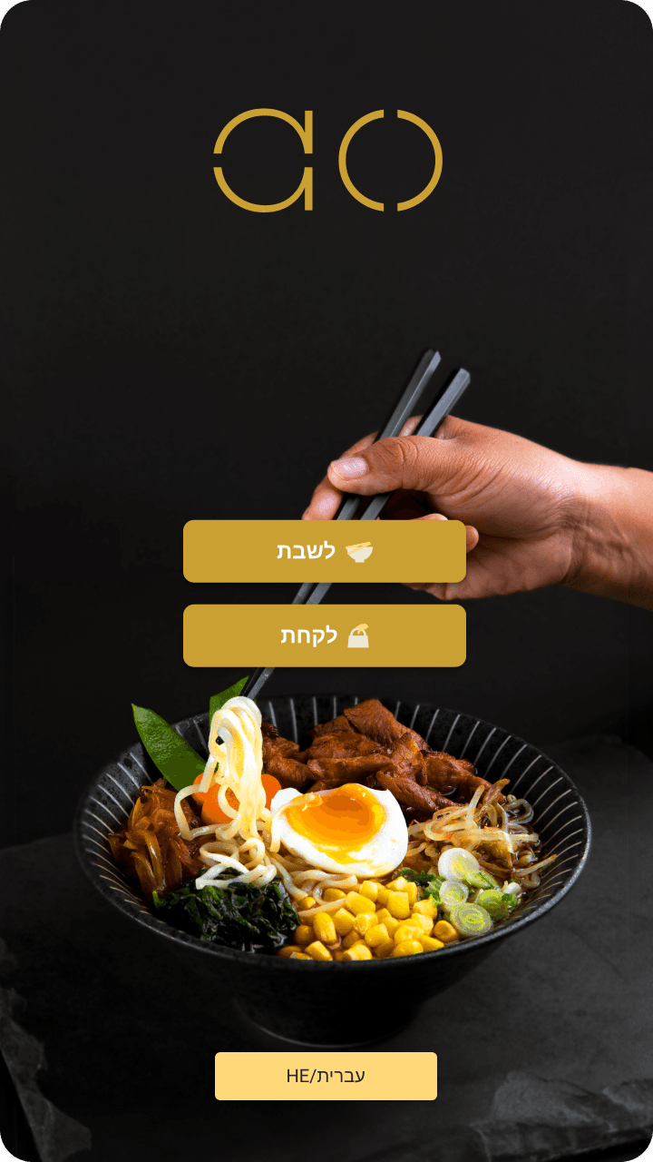
Ao Ramen is a restaurant that iterates on the traditional ramen experience by allowing customers to fully customize their bowls. To enhance this unique offering, they sought to create a kiosk interface that would make the selection process both accessible and enjoyable.

02

What is Ramen?

Research and Discovery

Research and Discovery

Asking the Right Questions

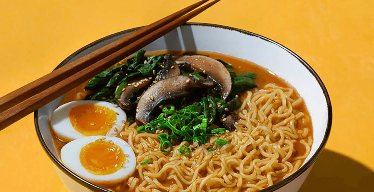
To understand the foundation of our design, we explored the origins of ramen. This beloved dish, which began in Yokohama Chinatown, consists of three main elements: broth, noodles, and toppings. By appreciating its roots, we recognized the significance of customization in today’s culinary landscape.
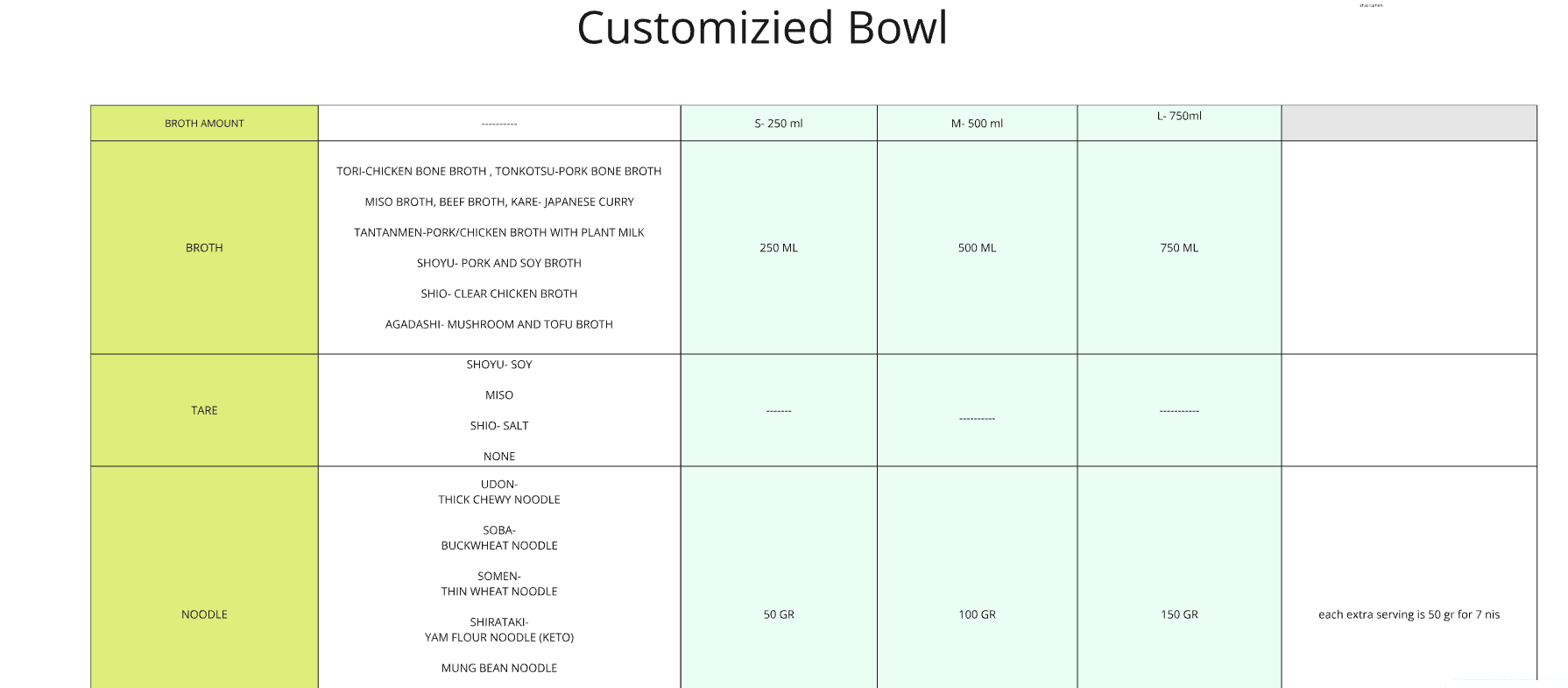
Breaking Down a Bowl

Understanding the essentials helped us delve deep to identify the various components within each category. Through blogs and recipes, we established a structure that would inform the user journey, guiding customers through the customization process.
Competitior Research
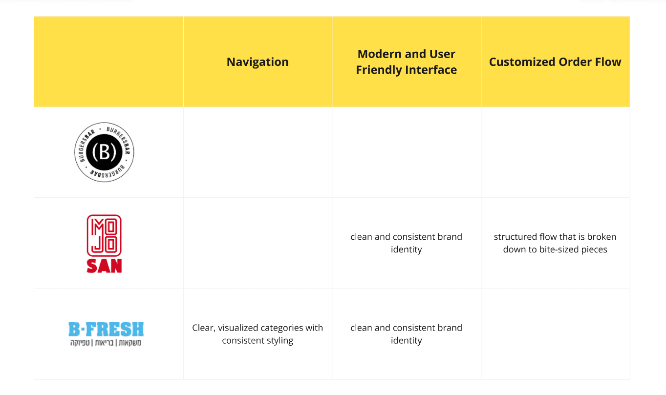
To ensure our kiosk stood out, we examined restaurants that use similar kiosk systems. While enjoying their offerings, we analyzed their interfaces to learn from their strengths and identify opportunities for improvement.

To ensure our kiosk stood out, we examined restaurants that use similar kiosk systems. While enjoying their offerings, we analyzed their interfaces to learn from their strengths and identify opportunities for improvement.

To ensure our kiosk stood out, we examined restaurants that use similar kiosk systems. While enjoying their offerings, we analyzed their interfaces to learn from their strengths and identify opportunities for improvement.

03

Key Objective

Insight & Objectives

Insight & Objectives

Synthesis

Our primary goal was to design an intuitive kiosk that made customizing a ramen bowl simple and enjoyable for all users. This objective served as our guiding principle throughout the project.

Target Audeince

The audience for the custom bowl experience was received through the design brief and narrowed down for clarity. Our users are:

Ramen Enthusiasts

Experience Collectors

Curious Eaters

04

Design Process

Concept Exploration

From IA to Final Design

Design Process

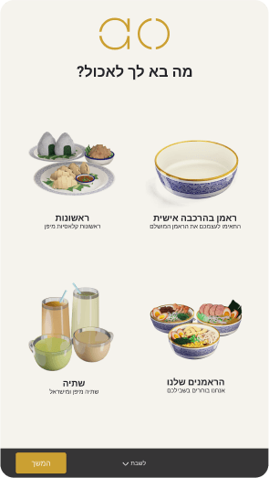
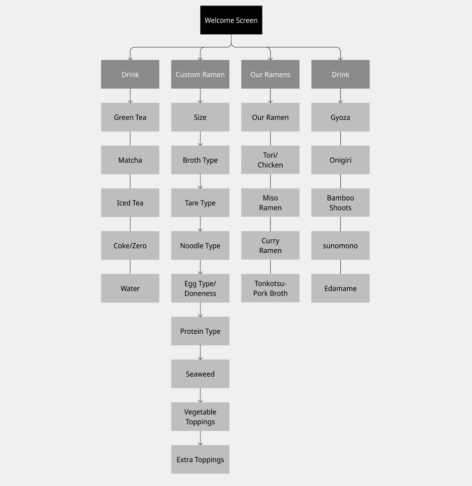
The process began by mapping the information architecture, laying the groundwork for a seamless user experience. This structure helped us identify key user pathways for customizing ramen bowls.
Wireframes

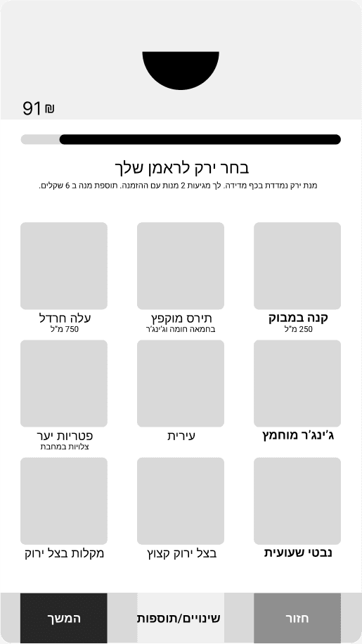
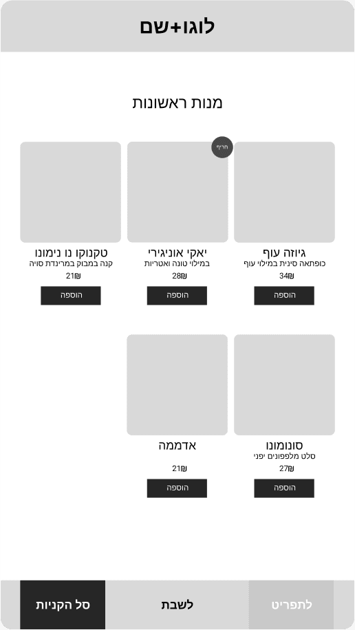
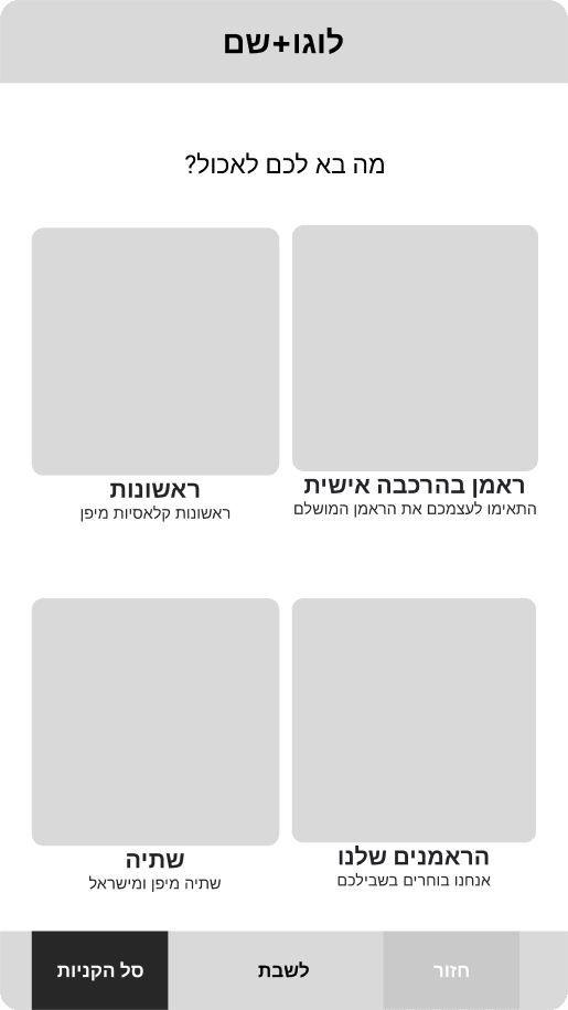
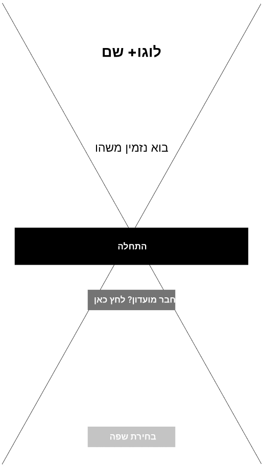
During the wireframing stage, we faced challenges in determining the optimal display size for the main element of the advancing bowl. Our priority was to ensure that the information remained clear and accessible, guiding users effectively through the customization process.

During the wireframing stage, we faced challenges in determining the optimal display size for the main element of the advancing bowl. Our priority was to ensure that the information remained clear and accessible, guiding users effectively through the customization process.

During the wireframing stage, we faced challenges in determining the optimal display size for the main element of the advancing bowl. Our priority was to ensure that the information remained clear and accessible, guiding users effectively through the customization process.

Final Design

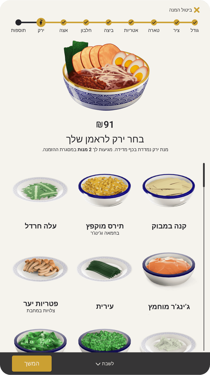
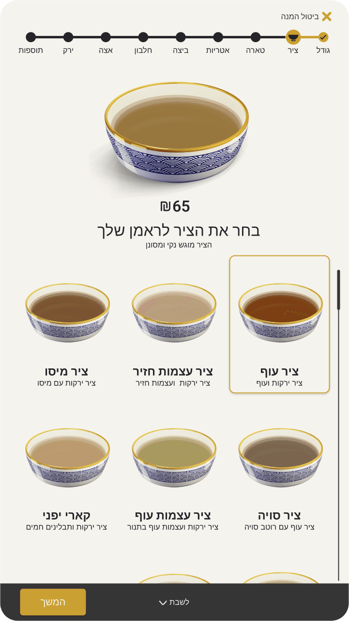
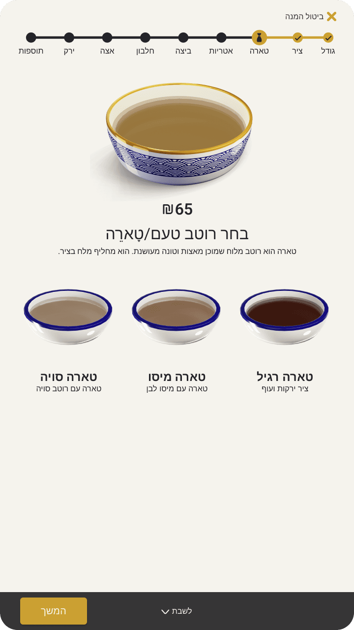
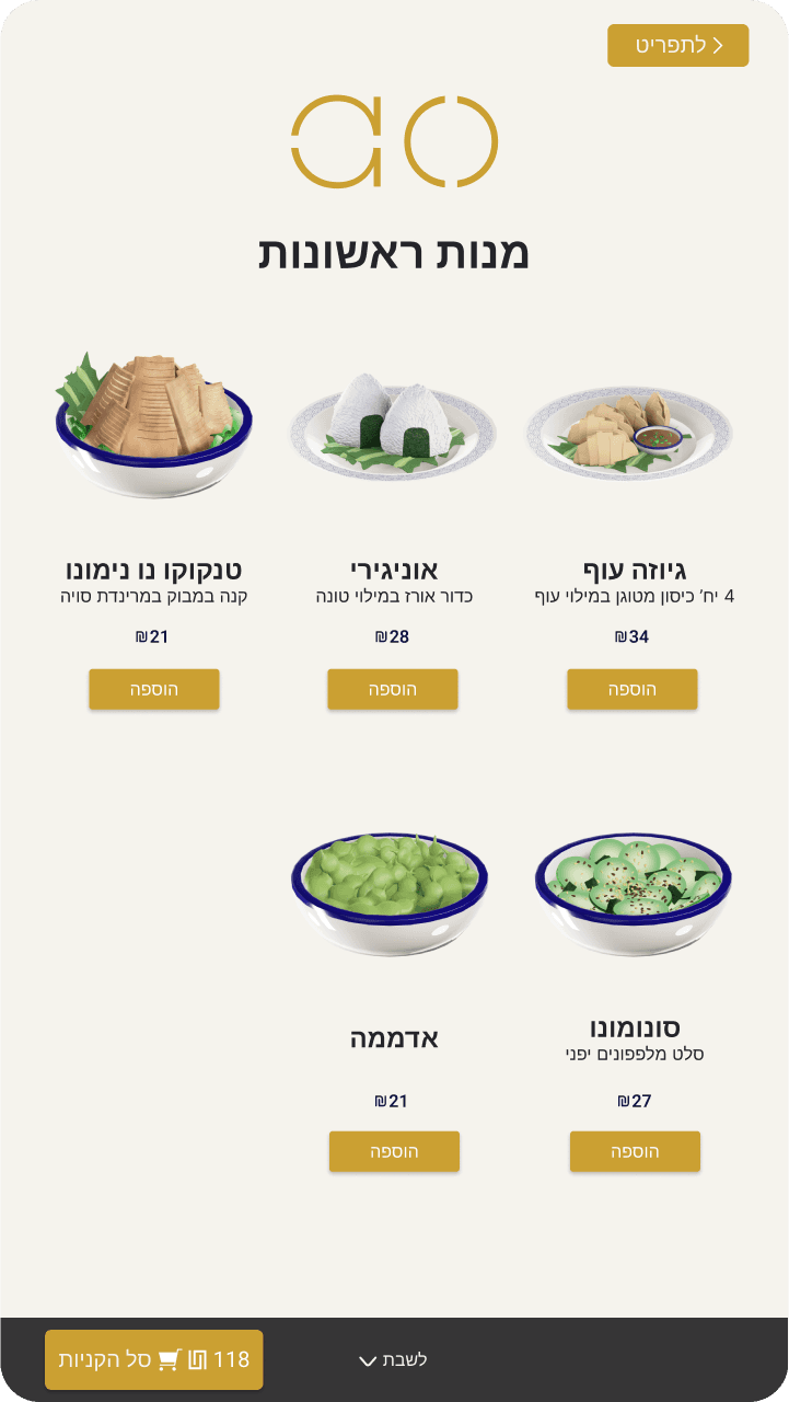
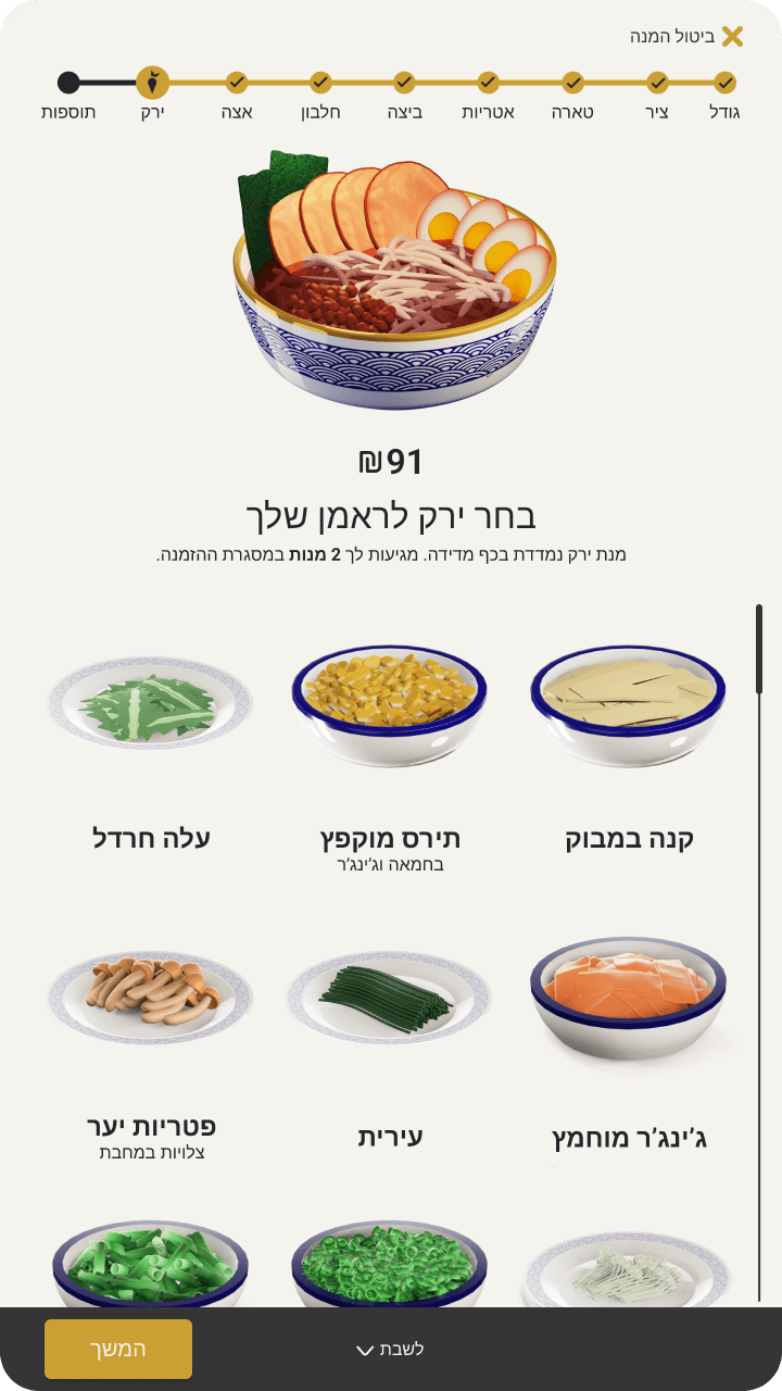
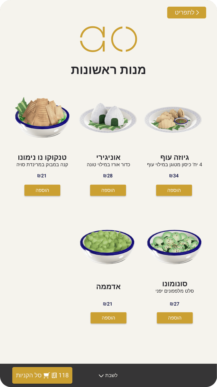
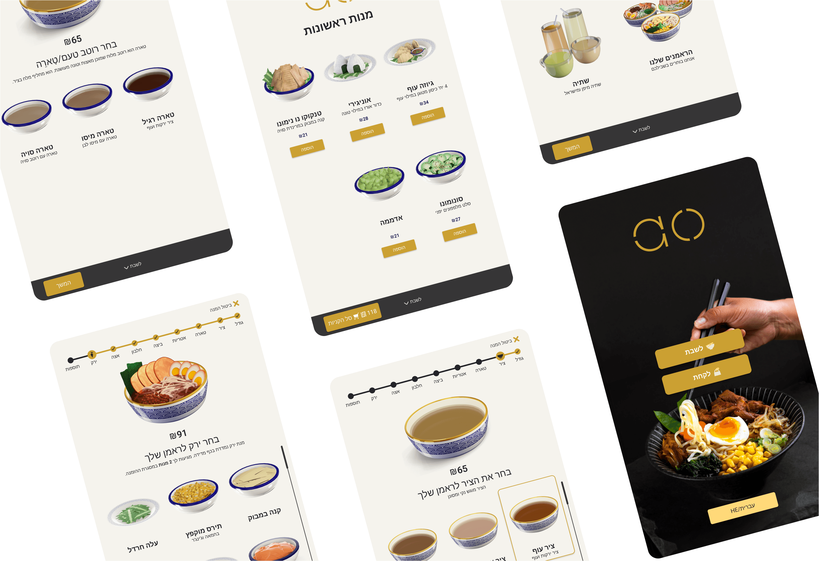
In the final UI, we made a significant change by increasing the size of the custom bowl display. This enhancement allowed users to view all the details more clearly, ensuring an engaging and informative customization experience.

In the final UI, we made a significant change by increasing the size of the custom bowl display. This enhancement allowed users to view all the details more clearly, ensuring an engaging and informative customization experience.

In the final UI, we made a significant change by increasing the size of the custom bowl display. This enhancement allowed users to view all the details more clearly, ensuring an engaging and informative customization experience.

05

Systemizing Design

Narrowing Down

Visual Design

Picking a Direction

While Concept 1’s logo felt friendly, it lacked the precision required to build trust with the audience. Concept 2's logo has a strong tech feel but lacks contrast. Concept 3’s logo stands out but isn't connected to music. By merging elements from the first two logos, I developed a final version that balanced approachability and innovation.

Design System

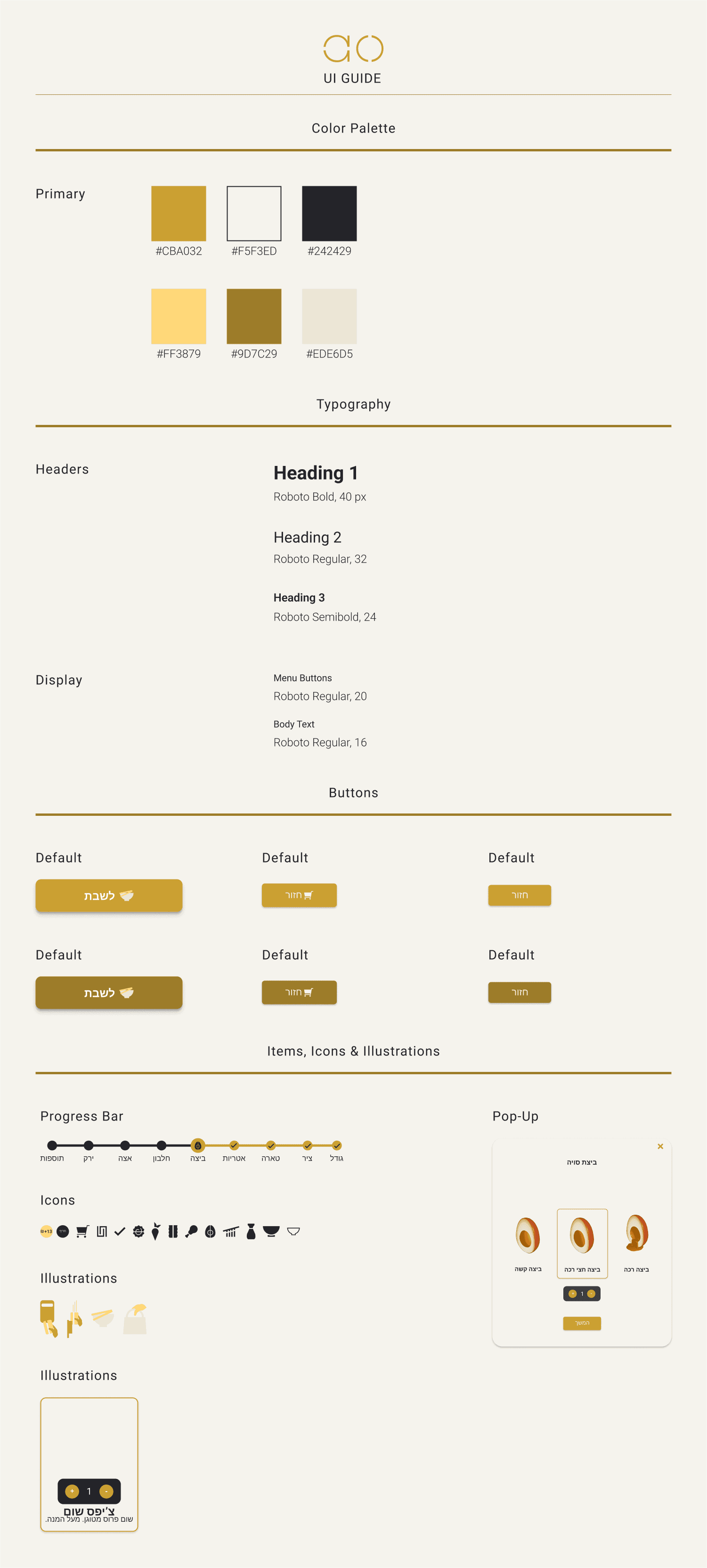
To ensure the components are implemented consistently across the site, I created a UI guide with details on color palettes, typography, and reusable UI elements.
Ready to collaborate?

theletadam@gmail.com

Ready to collaborate?

theletadam@gmail.com

Ready to collaborate?

theletadam@gmail.com